

A second look at a car-transport website I designed before — same brand and pages, rebuilt around a quote.
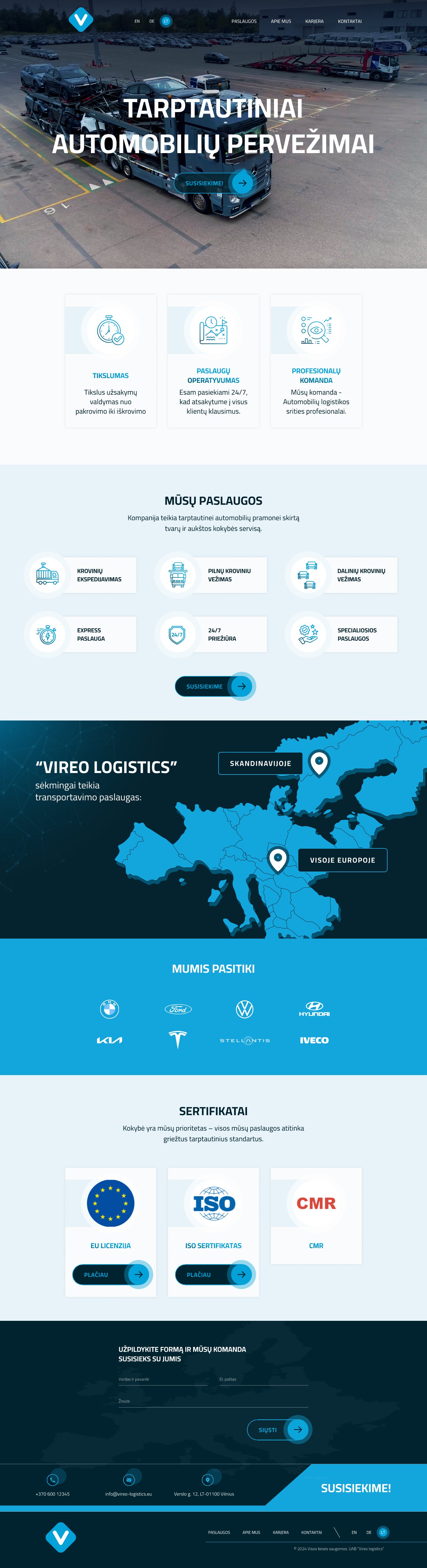
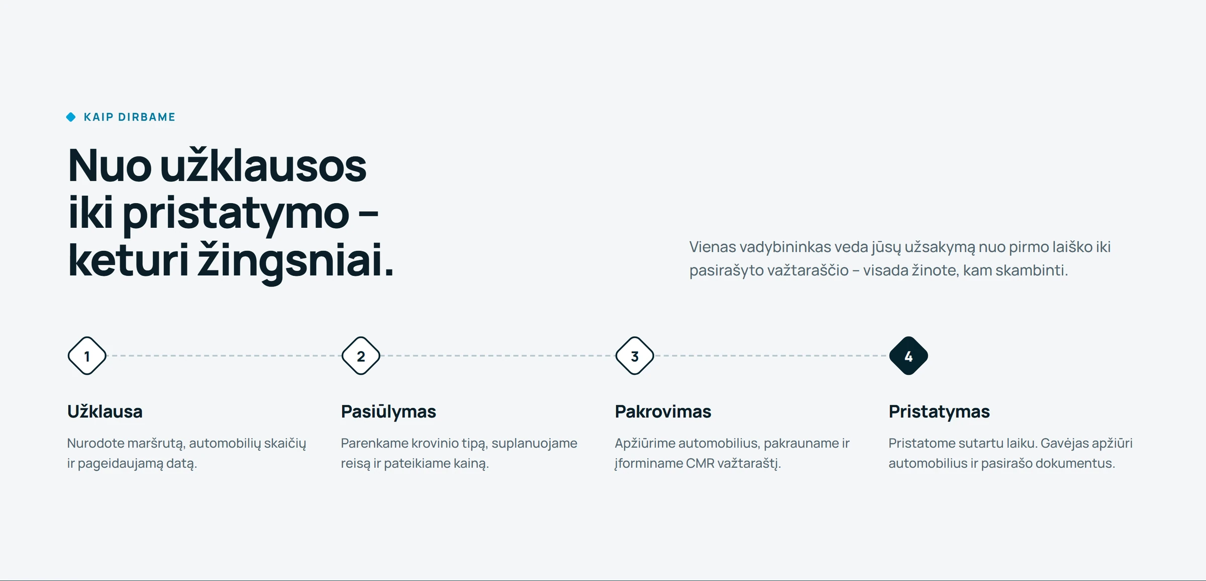
The client moves cars across Scandinavia and Europe. My first version had the right pages, but a visitor could only press "Susisiekime" — get in touch. I went through it as a customer and noted where it made them work.
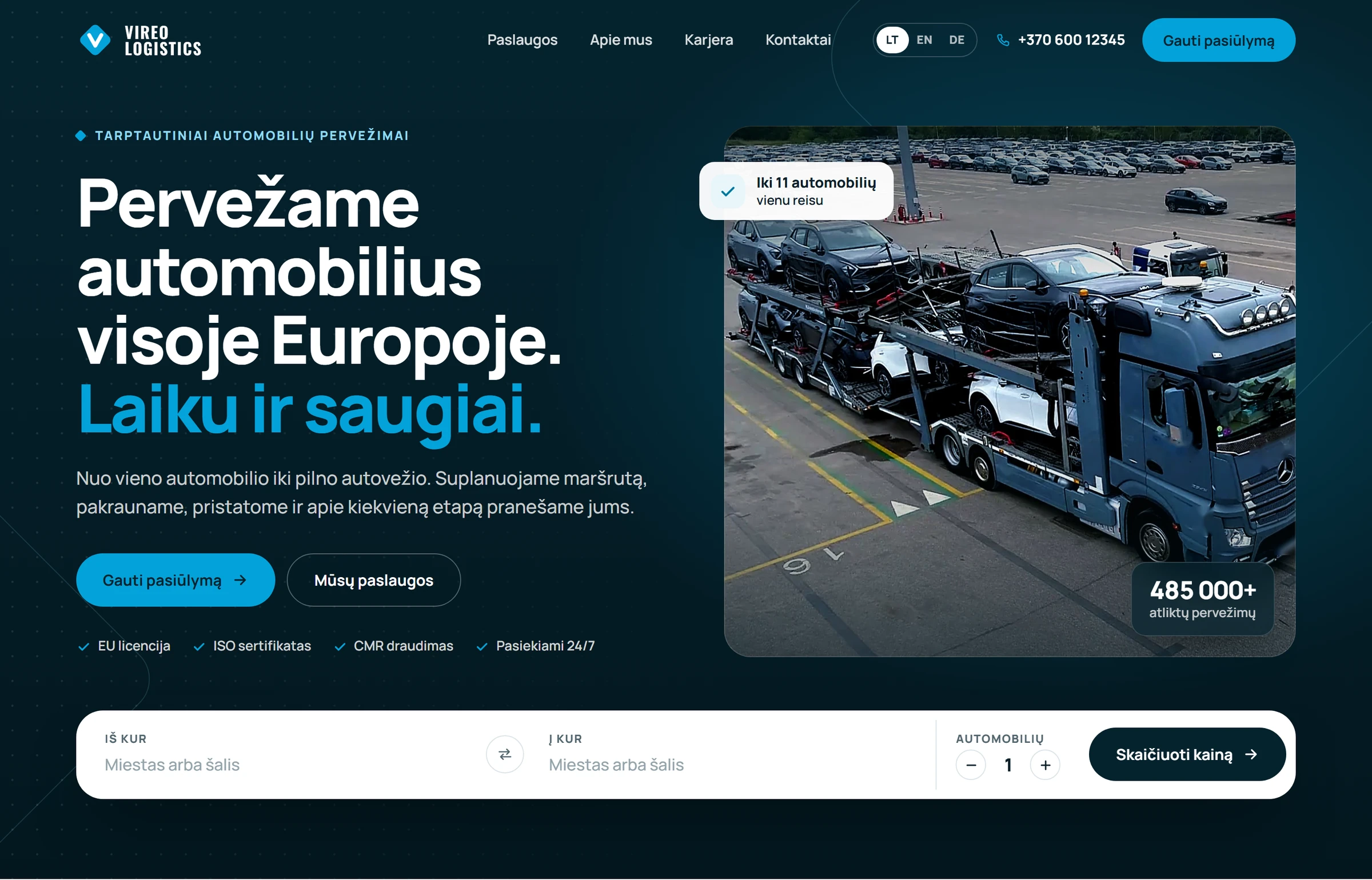
Keep the brand. Change the question from "who are we?" to "what do you need moved?"
The menu keeps its four links and gains two things that are always visible: the phone number and "Gauti pasiūlymą" — get a quote. Parts marked in bold are new.
Five decisions — each next to the piece of my first version it replaces.
One bar under the headline: from, to, how many cars. It opens the full form with the answers already filled in.
Why"Get in touch" asks the visitor to write a letter. Three small fields ask for what they already know — and give the company a request it can price.
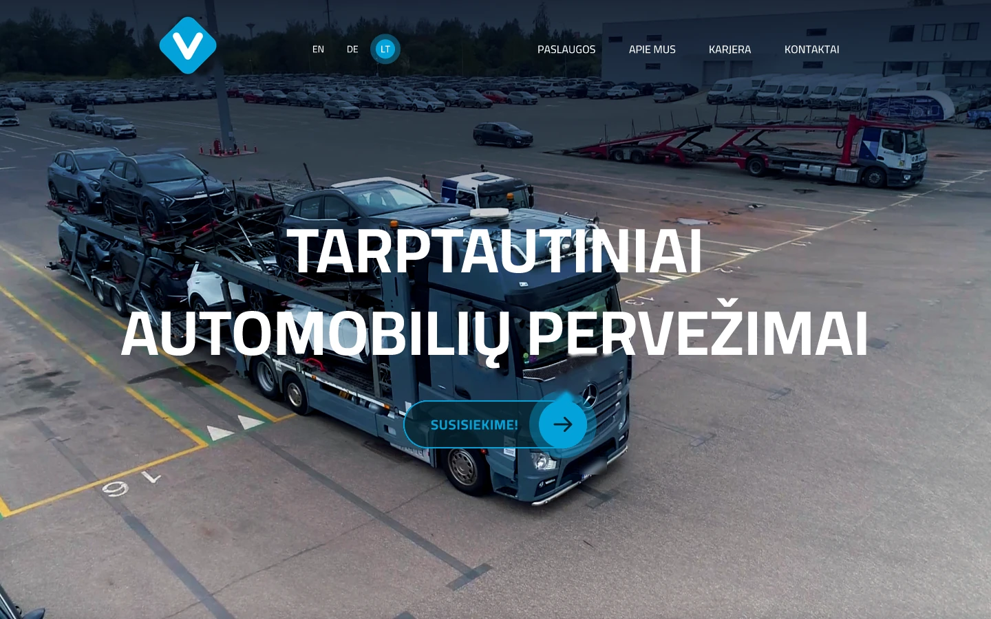 First versionA centred all-caps headline over the photo and a single "Susisiekime!" button.
One drawing of a carrier with eleven places: full for a full load, three for a partial one. In the form it fills up with the number of cars.
Why"Up to 11 vehicles" is a number; a carrier with free places is an answer. The customer sees which offer is theirs before reading a line.
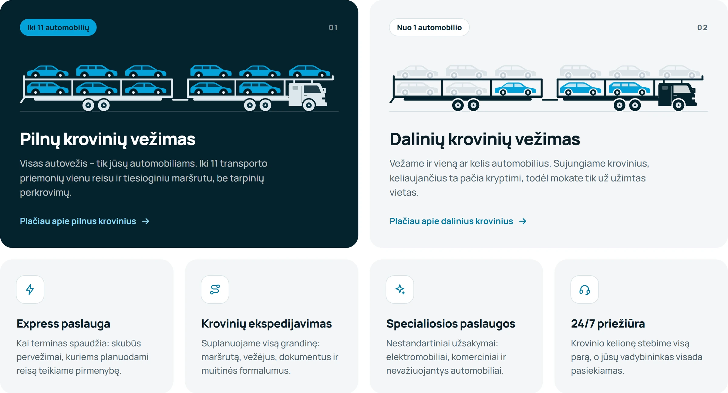
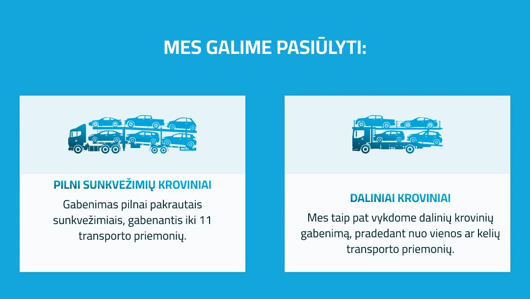 First versionTwo small icons on a blue band, deep on the Services page.
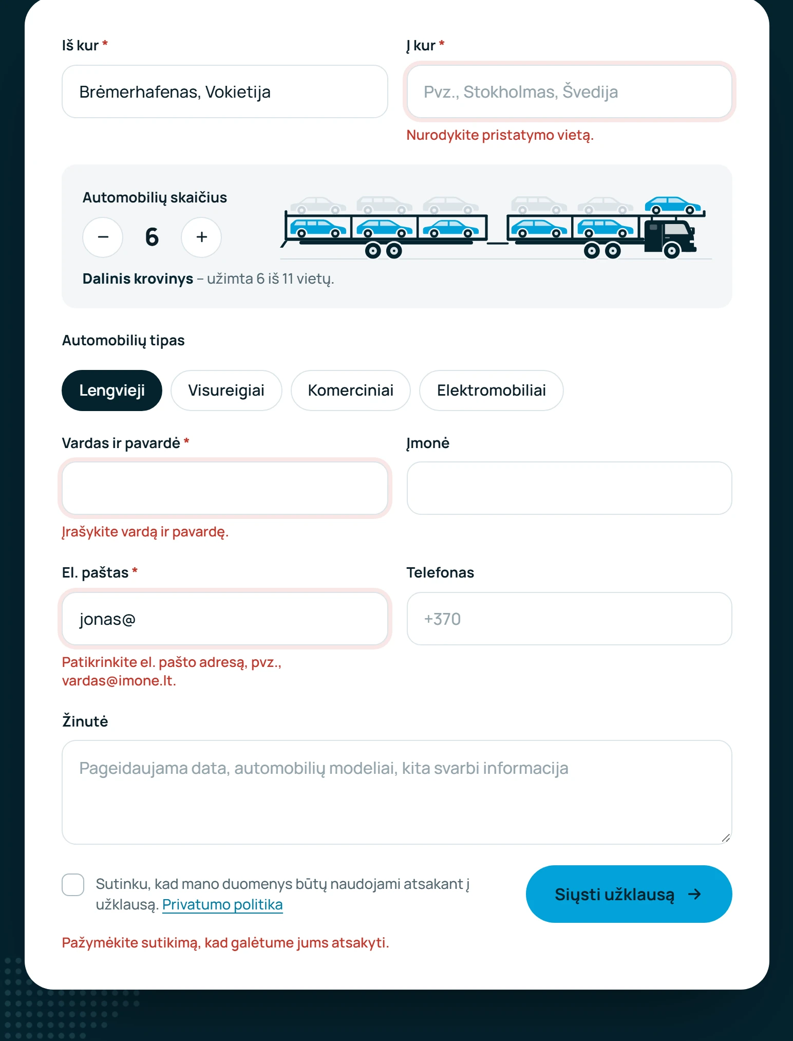
Labels above the fields, car types as chips, errors named next to the field. After sending — a clear "thank you".
WhyMy first form had three underlined fields and placeholder text as labels. A request for transport needs a route and a number of cars to be answered at all.
Years, transports, clients and team sit right under the hero, with logos and certificates further down.
WhyA company with 485 000 transports behind it should not keep that deep inside "About us".

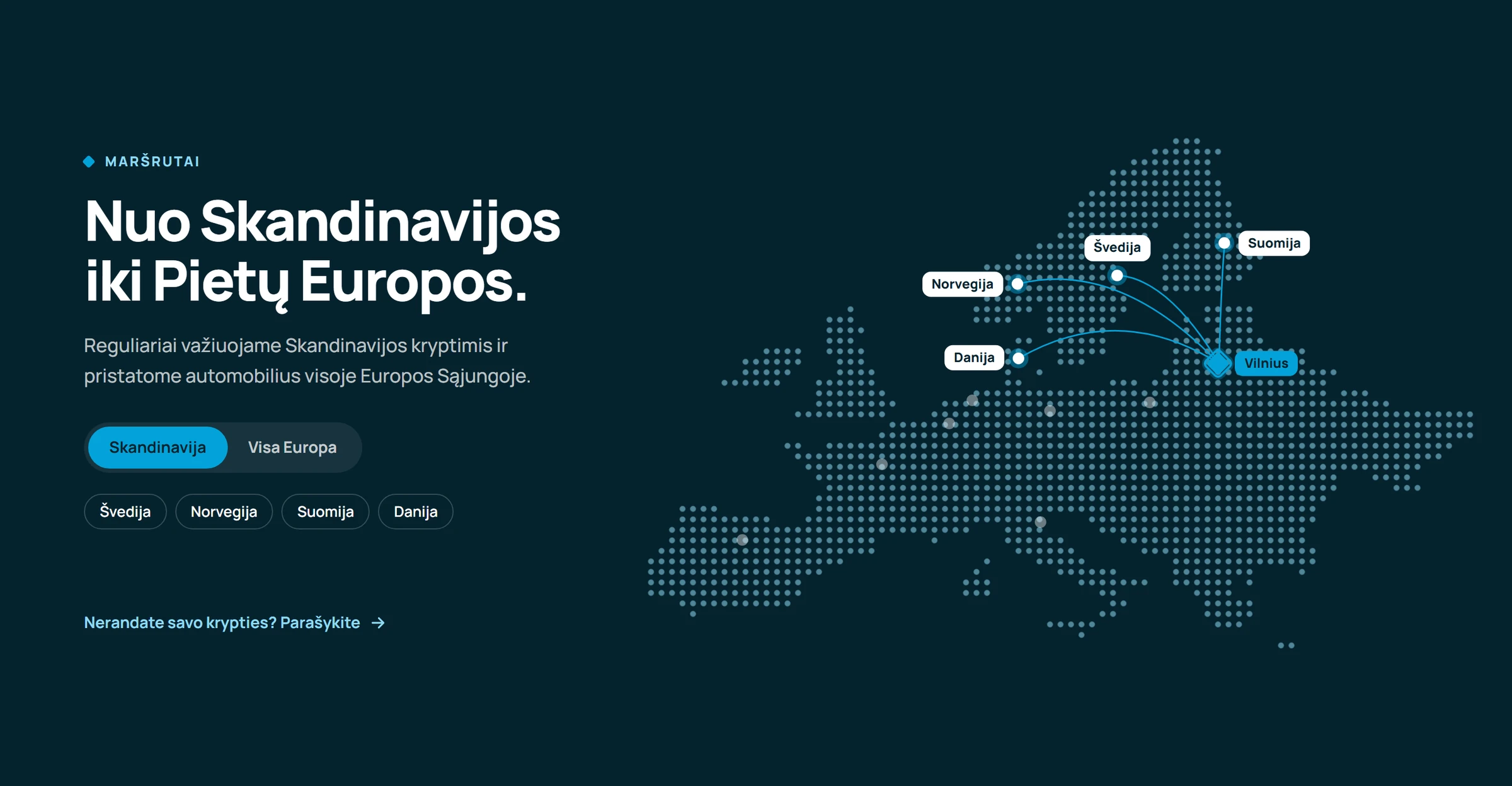
Routes from Vilnius on two tabs — Scandinavia and the rest of Europe — with the countries listed beside them.
Why"Skandinavijoje" and "Visoje Europoje" are the company's own two words for where it works. The map keeps them and makes them concrete.
Same logo, same colours, same photo. Hover either page to scroll through it.
The redesign is not a set of pictures: the menu, the forms, the map tabs and the car counter all work. Hover a page to scroll, click to open it full size.
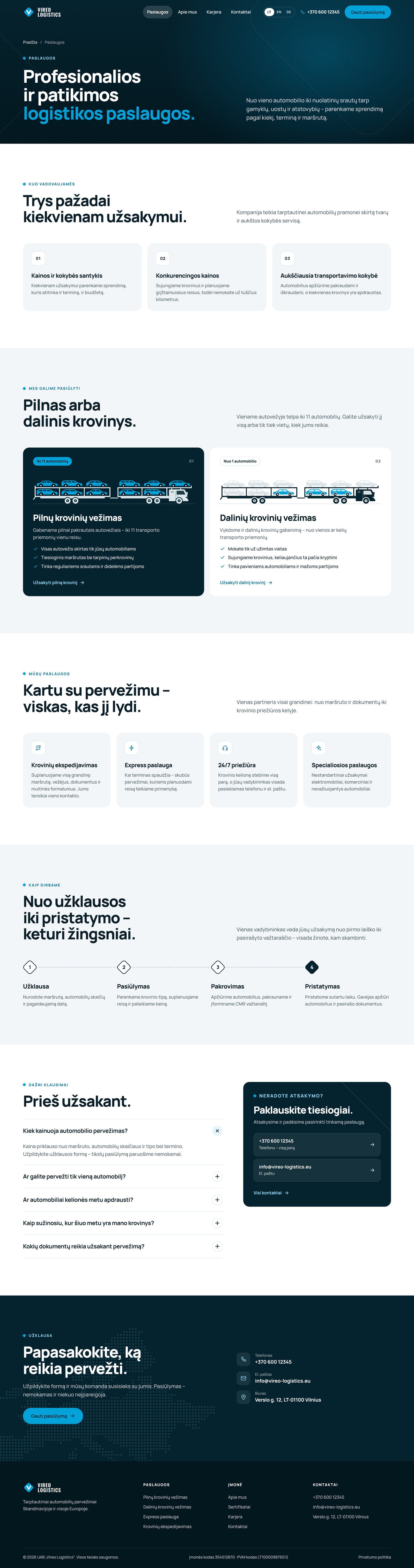
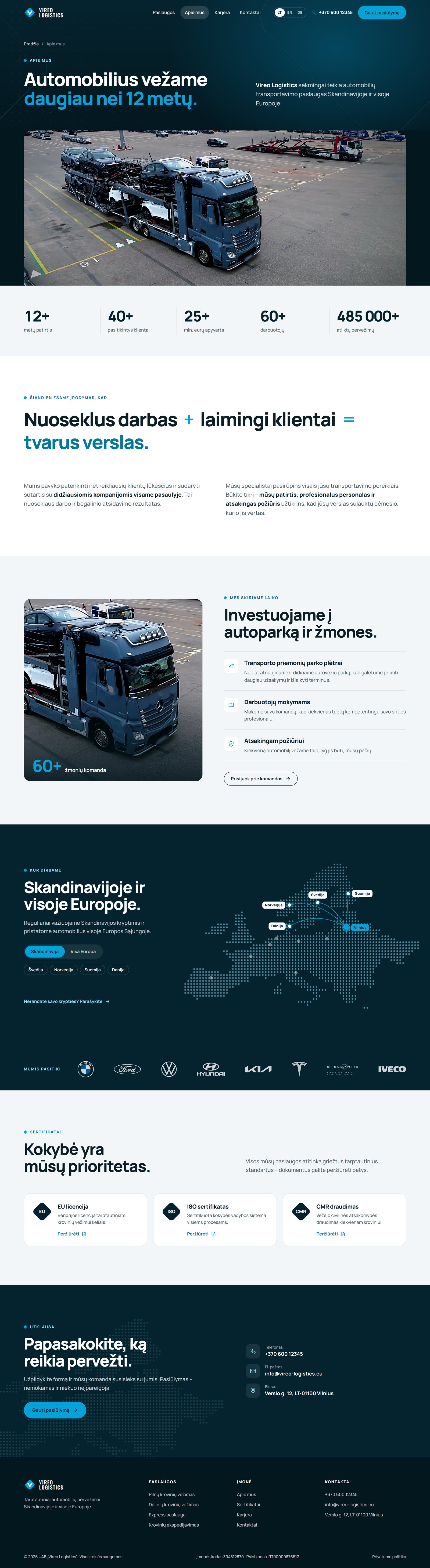
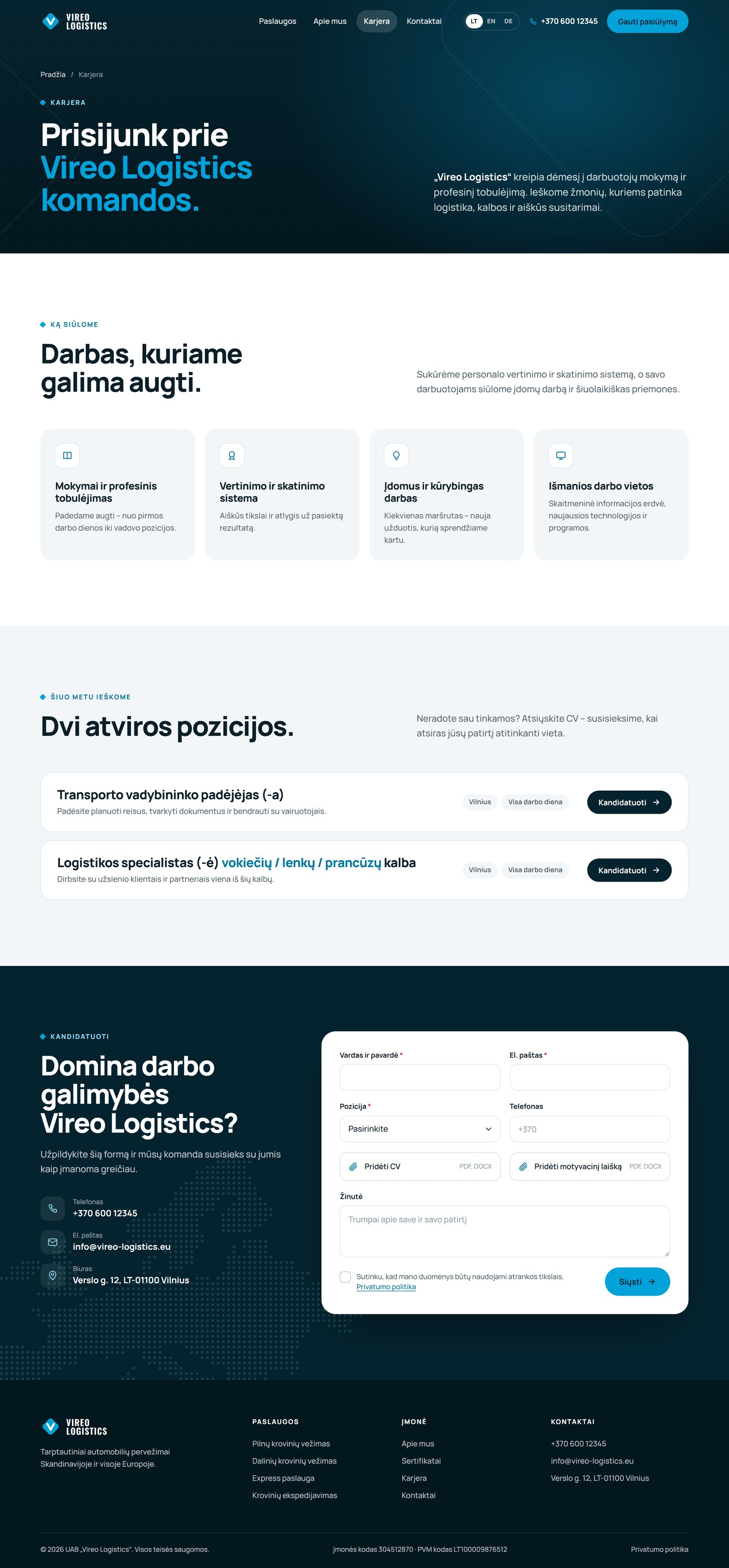
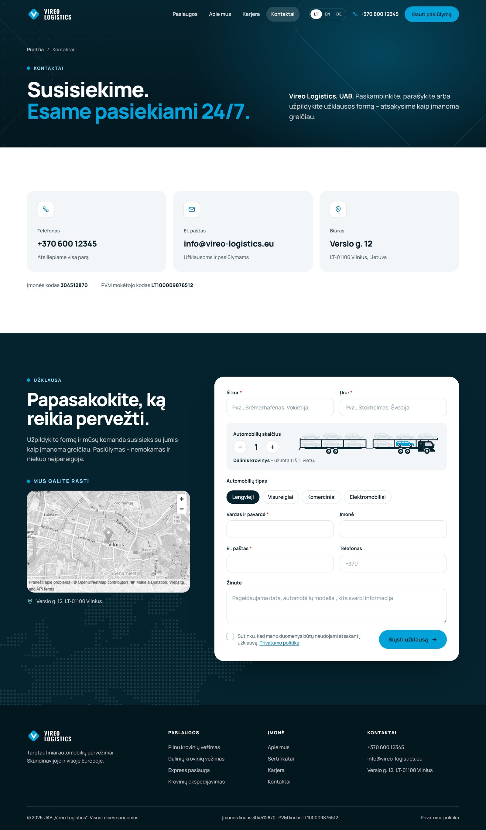
All five pages open in a new tab. Fill in the quote bar, change the number of cars, switch the map.
Open the prototype open_in_new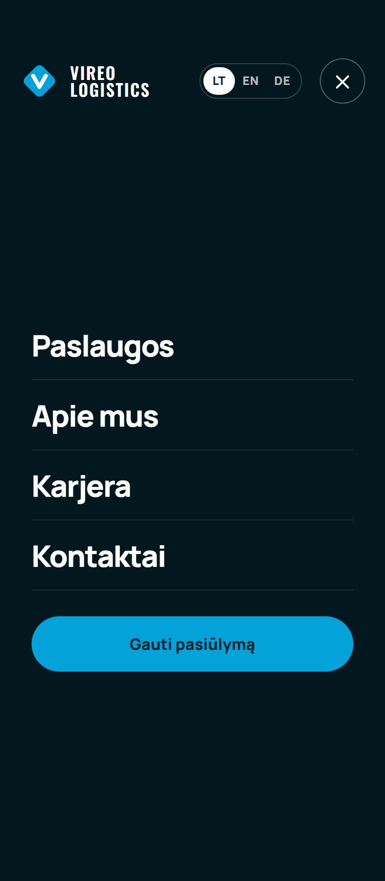


Cyan and navy come from the logo, and its diamond marks bullets and steps. Headlines drop the capitals; the photo is graded darker to fit the navy.
#05232ETop sections, footer, text#03171FHero background#03A2D9Actions and accents#8FD9F2Labels on dark#F3F6F8Cards and light sections