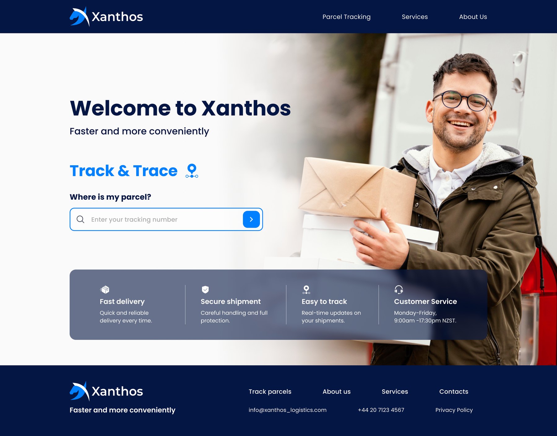

A new website for a parcel delivery and tracking company — built around the question most visitors bring: where is my parcel?
Xanthos delivers parcels for people and businesses. People usually come to a delivery company's website with a tracking number and a bit of worry; some come to compare services or find a contact. The new website had to answer the first need in seconds, and still explain the company well.
Find the tracking field at once and understand the answer.
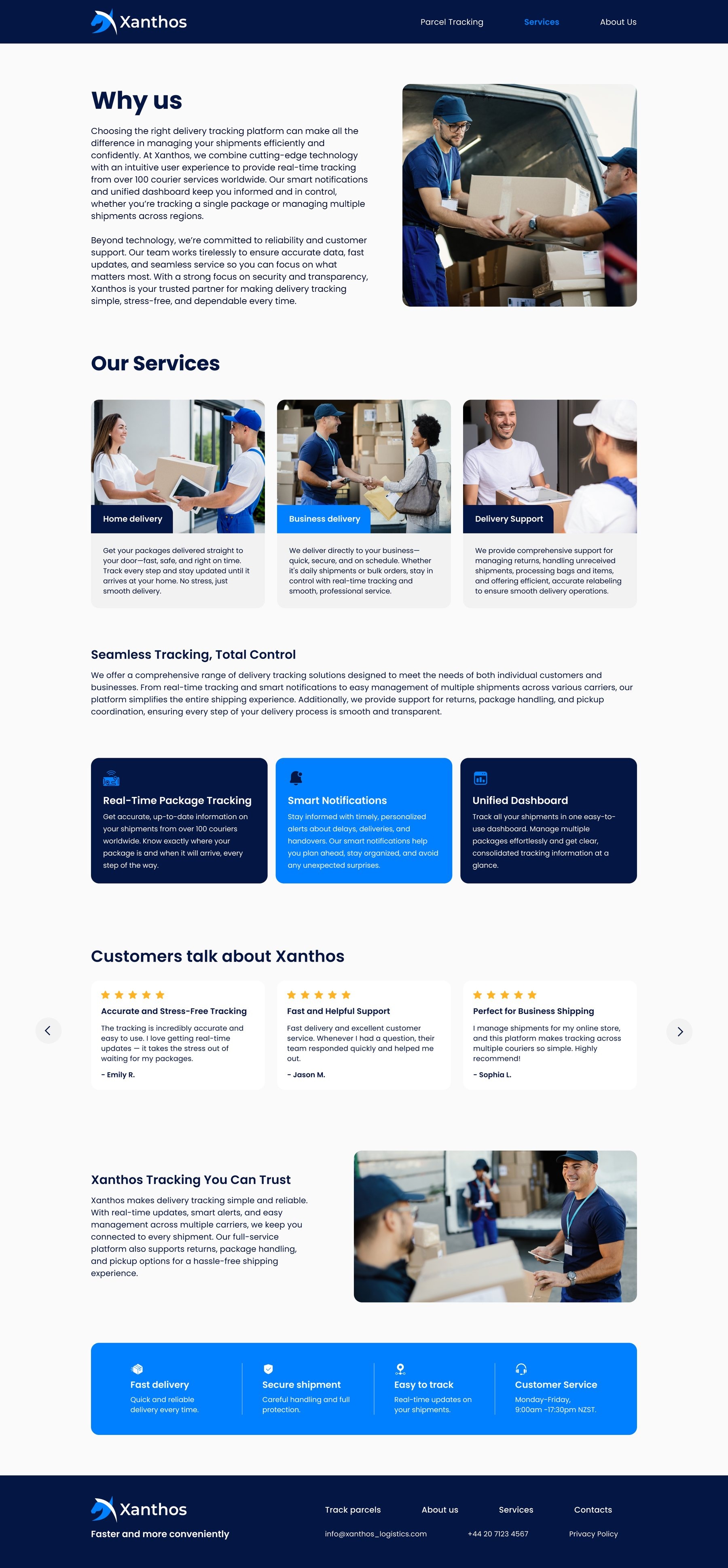
Home delivery, business delivery and delivery support, side by side.
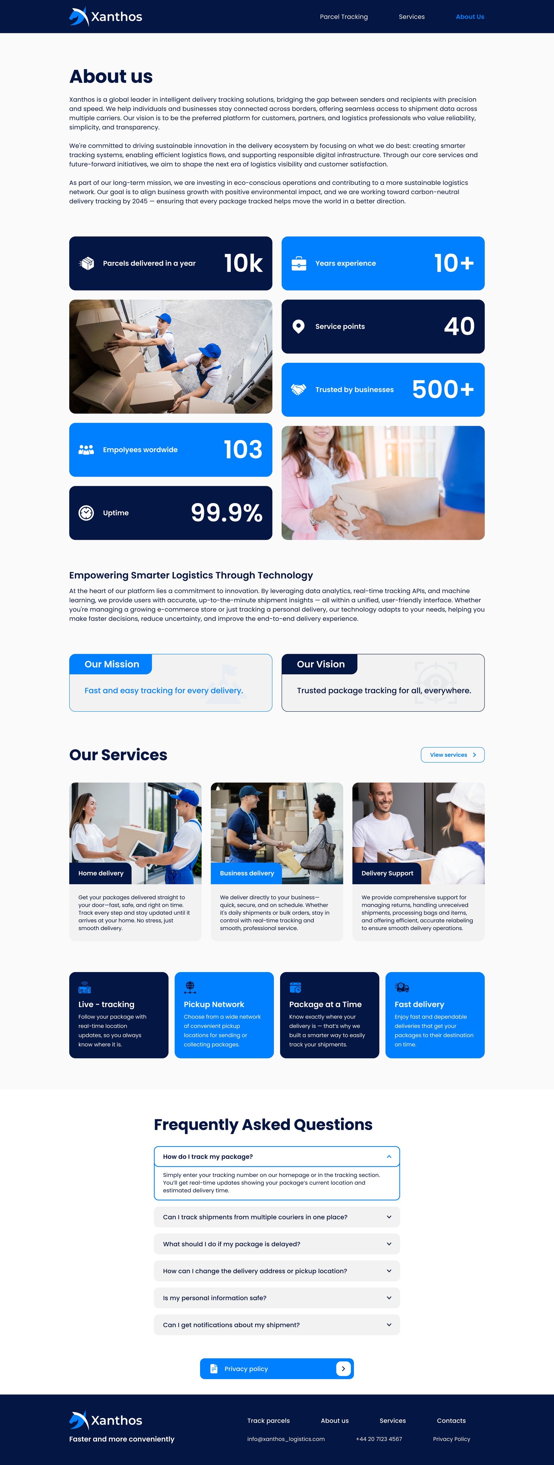
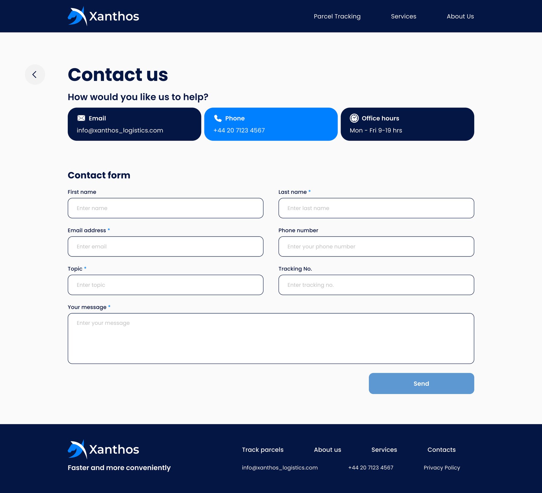
Answers to common questions, contacts and support hours.
Answer "where is my parcel?" in seconds — then make an unfamiliar brand easy to trust.
Three links in the header, with Parcel Tracking first. Every page ends with the same footer: the tagline, the main links, e-mail, phone and the privacy policy.
Four decisions behind the website — each shown with a real piece of the design.
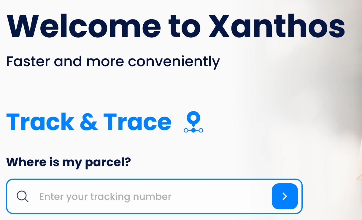
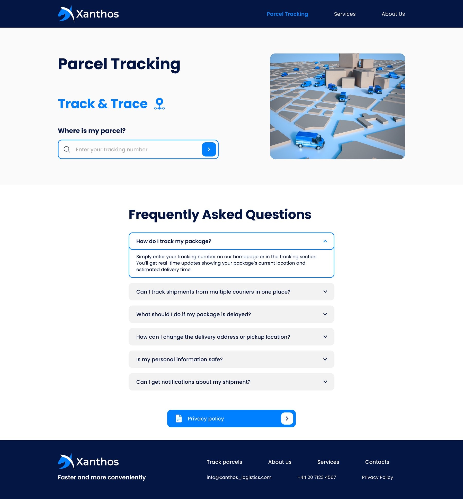
The homepage opens with "Track & Trace" and a single field: "Where is my parcel?". The same search sits on top of the tracking page, and Parcel Tracking is the first link in the header.
WhyMost visitors have one job. Putting it first saves a click — and a moment of worry.
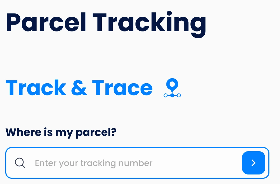
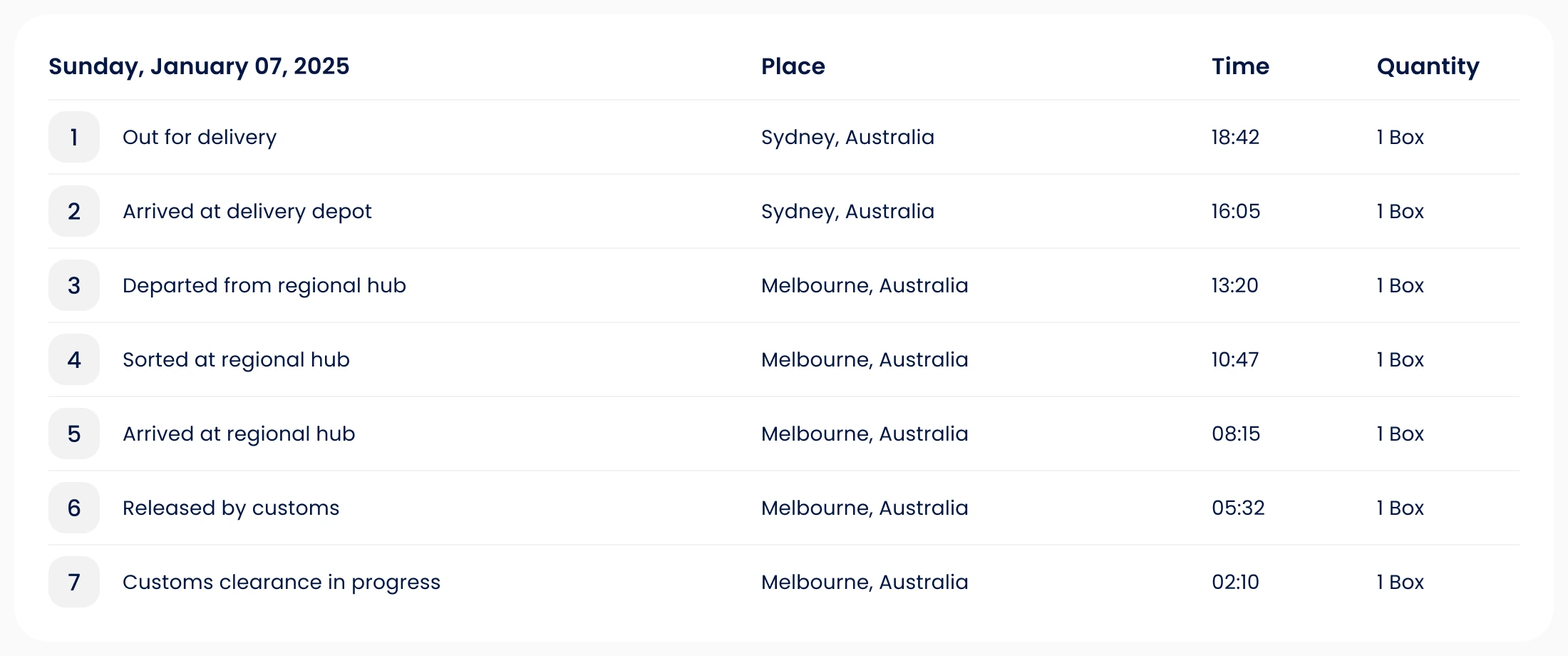
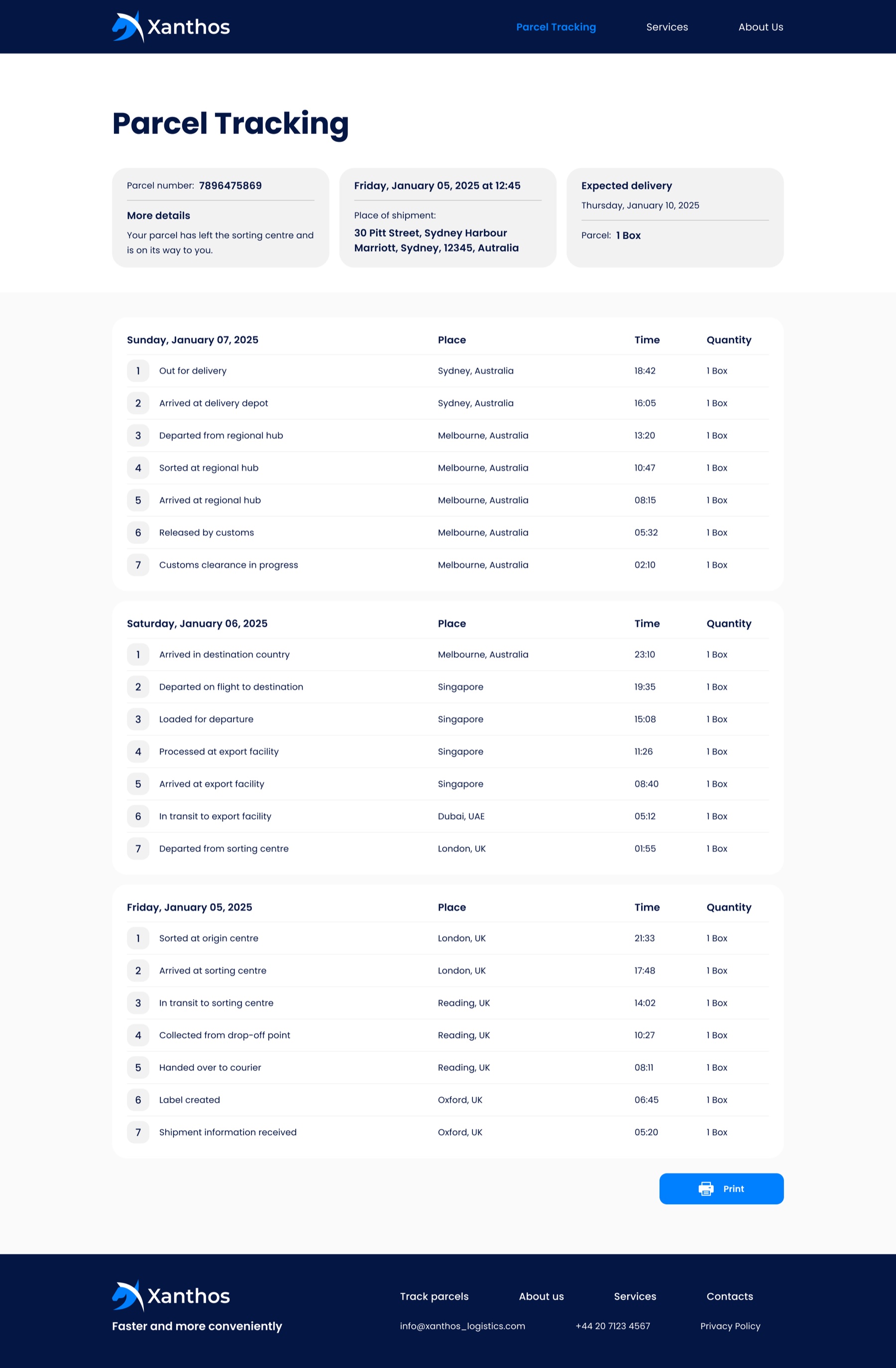
The tracking result starts with three summary cards: the parcel number, the place and time of shipment, and the expected delivery. Below, every step is grouped by day with place, time and quantity — and the page can be printed.
WhyA raw list of scans is hard to read. The summary answers "when will it arrive?" before anyone has to scroll.
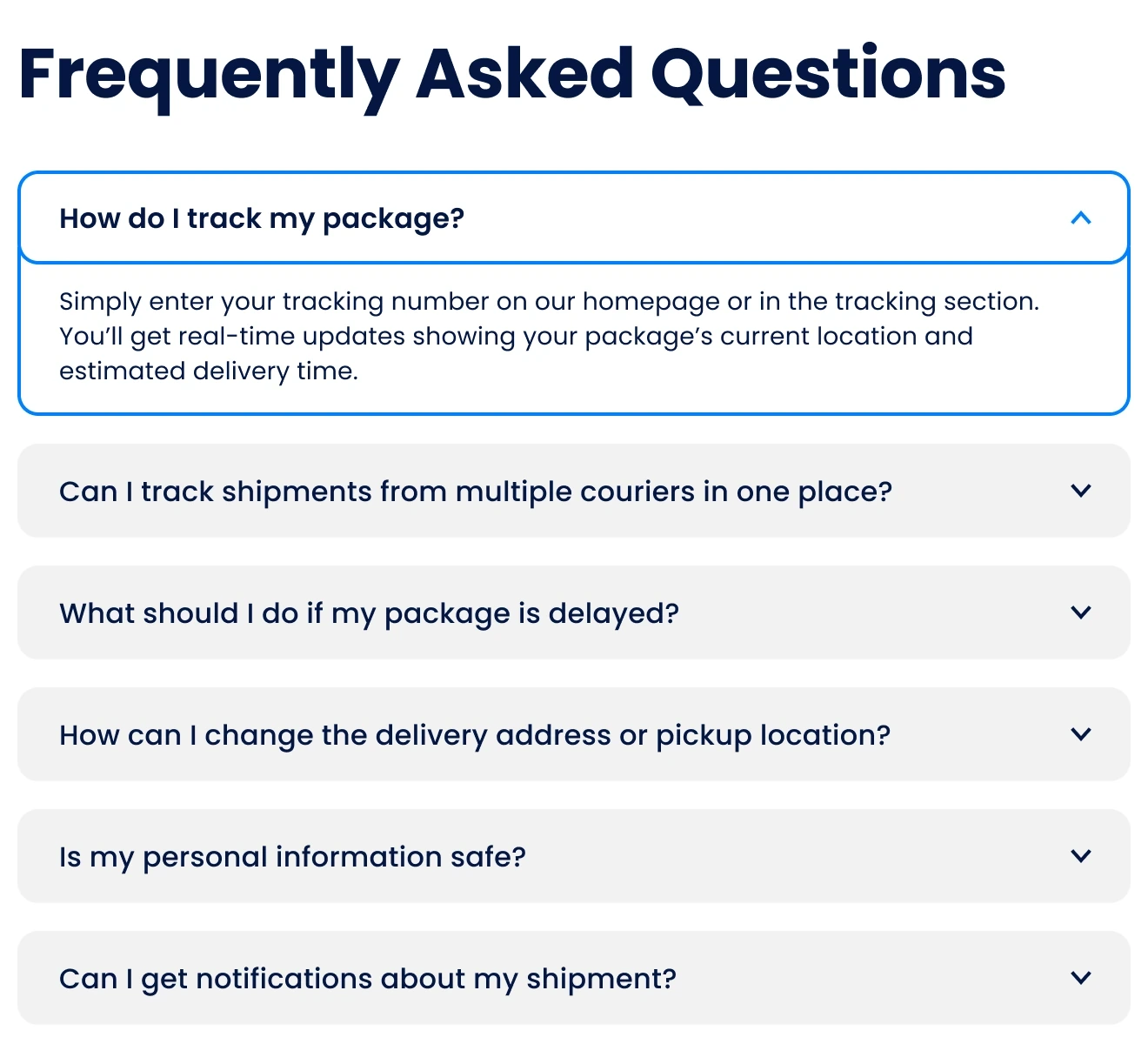
The tracking page has a short FAQ right under the search — how to track, what if the parcel is late, how to change the address, is my data safe — and a button to the privacy policy.
Why"What if it's late?" is the next question after tracking. Answering it on the same page can save a call to support.
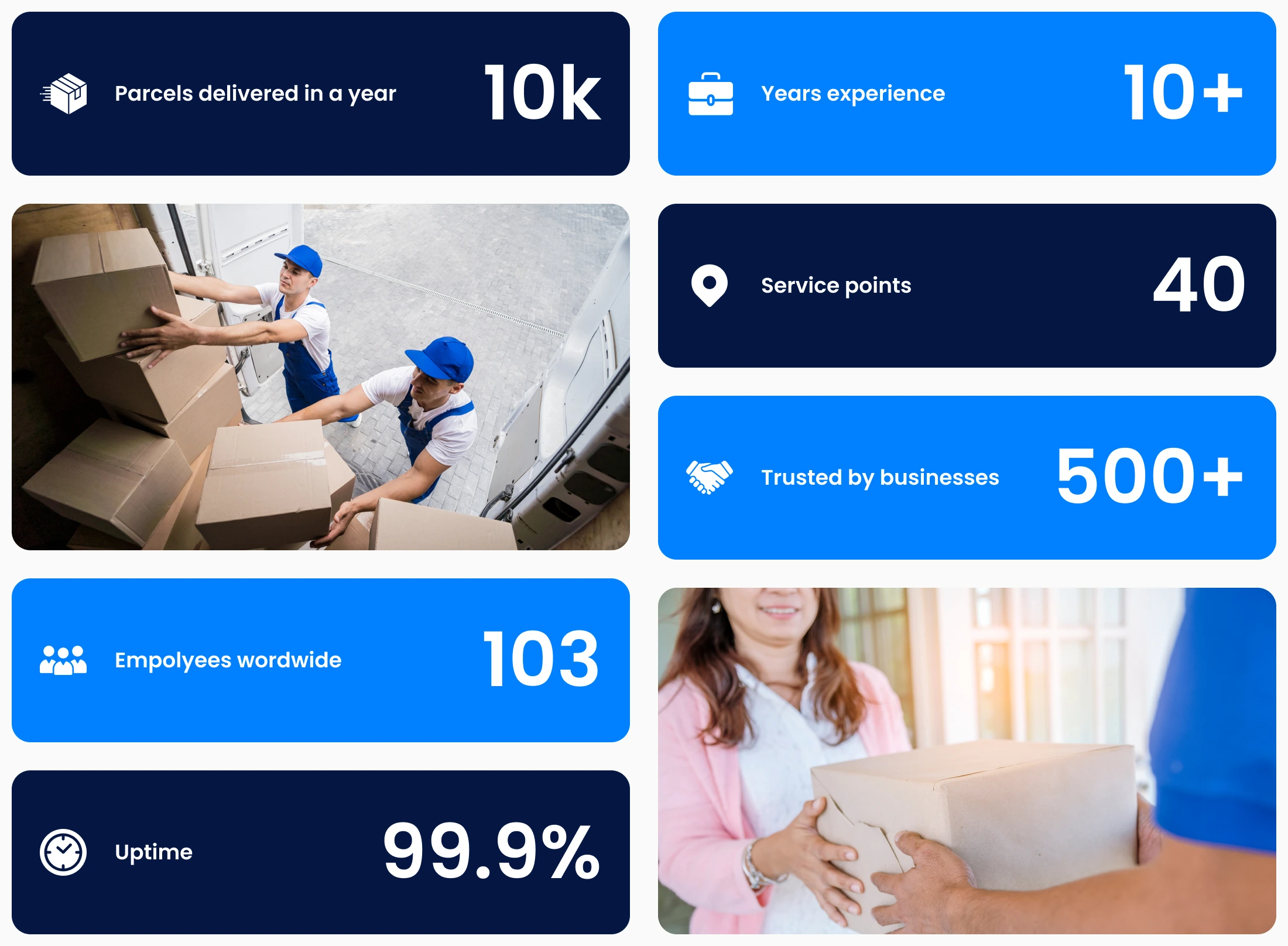
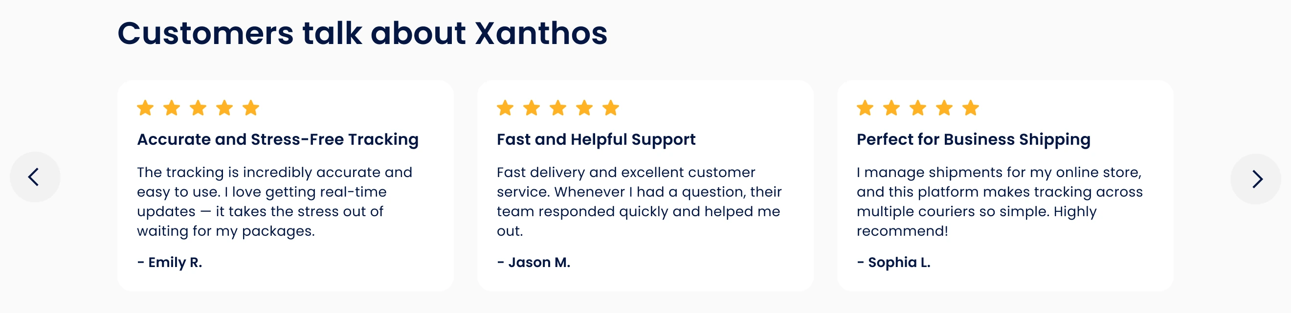
About us shows the key facts as big, scannable numbers between photos, then the mission and the vision in one line each. Services adds short customer reviews with stars, a title and a first name.
WhySocial proof matters most for a brand people meet for the first time — through a tracking number.

Hover a page to scroll through it, click to open it full size.
Navy gives the brand weight and reliability. Bright blue marks every action and everything about tracking, so the eye always finds it. Light greys keep long pages calm; amber is kept for the stars in reviews.
#041643Header, footer, titles#0080FFActions and tracking#5D6A8APromise bar over the photo#F2F2F2Cards and fields#FAFAFASection backgrounds#FFB325Review starsPoppins — round and friendly, but firm in bold titles. One family for headings, text, labels and numbers.